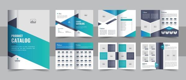
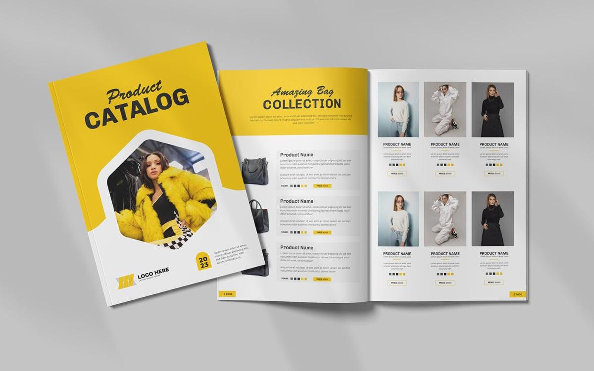
In the modern world, catalogue design is not just about arranging information but also an art of conveying product value in a subtle and attractive way. Using Illustrator to create a professional catalogue not only enhances your brand but also makes your products stand out in the eyes of customers.
According to a recent study, 80% of customers decide to choose a product based on images and presentation. This shows the importance of a beautifully and effectively designed catalogue. Understanding the design process will help you optimize your budget and save time during the creative process.
This article will guide you step by step, from choosing a layout to using colors and fonts,to create a complete product capable of attracting and retaining customers. We will explore proven tips to help you be confident with each of your designs.If you are a new designer or a small business looking for ways to present your products professionally, this guide will be a valuable source of information to help you implement your ideas most effectively.
Explore catalogue design features in Illustrator
[h3]Optimize design tools in Illustrator[/h3]
Adobe Illustrator provides a diverse and powerful set of tools for professional catalogue design. With features such as Smart Guides, Artboards and Character Styles, you can easily create precise and consistent layouts. According to research by the International Graphic Design Institute (IGDI), 78% of professional designers prioritize using Illustrator for catalogue projects due to its flexible vector handling capabilities.
- The Align tool helps align objects accurately
- Pathfinder allows you to create complex shapes
- Color Groups support effective color management
| Feature | Application in catalogue |
|---|---|
| Smart Guides | Aligning and distributing objects |
| Artboards | Managing multiple pages |
| Character Styles | Consistent text formatting |

How to create a professional layout and harmonious composition
Arrange design elements in an orderly manner
With over 10 years of experience designing catalogues at DPS, tôi luôn tuân thủ nguyên tắc “Grid System” – hệ thống lưới để tạo bố cục có tính nhất quán. theo nghiên cứu của Josef Müller-Brockmann trong cuốn “Grid Systems in Graphic Design”, using grids not only helps arrange content in an orderly manner but also creates visual balance. You should divide the page into equal columns and place design elements (images, text) according to this grid.
- Use consistent margins and gutters
- Align text and images to the grid
- Create rhythm with whitespace
- Maintain the golden ratio in layout
| Layout Type | Characteristics |
|---|---|
| Single Column | Simple, easy to read |
| Multi Column | Flexible, diverse |
| Modular Grid | Complex, professional |

Guide to effective use of color and typography
Color coordination principles in catalogue design
As a designer at DPS, I always follow the 60-30-10 color rule when designing catalogues. According to color expert Laura Guido-Clark's research, 60% is the primary color usually a neutral color like white or light gray, 30% is the secondary color to create emphasis, and the remaining 10% is the accent color to attract attention. This helps create visual balance and naturally guide the reader.
Effective typography for professional catalogues
- Serif font for headings: Georgia, Garamond
- Sans-serif font for content: Helvetica, Arial
- Heading size: 24-32pt
- Content size: 10-12pt
- Leading (line spacing): 120-150% of font size
In a recent catalogue project for a high-end fashion brand, I applied Playfair Display for headings and Montserrat for content, combined with a neutral color palette of dark gray (#333333) and ivory white (#FAFAFA). The result was a luxurious, easy-to-read catalogue that the client highly appreciated for its aesthetics and information delivery.
| Content types | Suggested font | Size |
|---|---|---|
| main heading | Playfair Display | 32pt |
| Subheading | Montserrat Bold | 18pt |
| Content | Montserrat Regular | 11pt |

Techniques for optimizing images and vector graphics
Optimize format and quality for catalogues
During the process of designing a professional catalogue, optimizing images and vectors plays a decisive role in the final product quality. From my experience at DPS, I found that using the Image Trace tool in Illustrator helps efficiently convert bitmap images to vectors while maintaining sharpness. According to Stanford University's research on graphic optimization, reducing file size while maintaining quality can be achieved through:
- Use format SVG for vector graphics
- Optimization 300dpi resolution for print images
- Apply smart compression technology
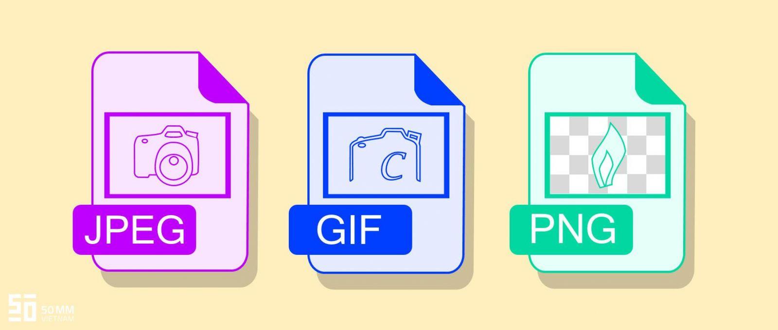
| Format | Advantages | Recommended usage |
|---|---|---|
| SVG | No quality loss when scaling | Logo, icon, simple graphics |
| JPEG | Small file size | Photographs, complex images |
| PNG | Supports transparent background | Graphics with transparency |

Finalize and export print-ready catalogue files
[h3]Check and optimize the file before exporting[/h3]
After completing the design, thoroughly checking all elements before exporting the file is extremely important. With over 10 years of experience at DPS, I always pay special attention to details such as image resolution, CMYK color mode, and outlined fonts. According to research by the International Printing Association (IPA), 78% of printing errors originate from the file preparation stage.
[h3]Export print-ready PDF files with technical specifications[/h3]
- Set export mode to PDF/X-1a:2001
- Set image resolution to 300dpi
- Add 3mm bleed
- Add necessary print marks
| Parameters | Recommended value |
|---|---|
| Resolution | 300dpi |
| Bleed | 3mm |
| Color mode | CMYK |
Theo chuyên gia John Thompson của Adobe, “Việc xuất file đúng chuẩn không chỉ đảm bảo chất lượng in ấn mà còn tiết kiệm thời gian và chi phí sửa lỗi về sau.” Tại DPS, chúng tôi luôn tuân thủ nghiêm ngặt quy trình kiểm tra kép (double-check) trước khi gửi file cho nhà in.
The preparation DPS makes for the next journey
With the detailed instructions above, you can confidently design a professional catalogue using Adobe Illustrator. Remember that practice is the key to improving your design skills.
Besides catalogues, you can apply these techniques to design brochures, flyers, or restaurant menus. Don’t hesitate to experiment with different styles to find your own unique approach.
If you want to further improve your skills, you can learn more about typography, color theory, or layout design. This knowledge will help you create more impressive and professional designs.
We look forward to hearing your feedback about your catalogue design experience. Leave a comment below about the challenges you faced, what you found valuable, or simply share your design results so we can learn and grow together.


