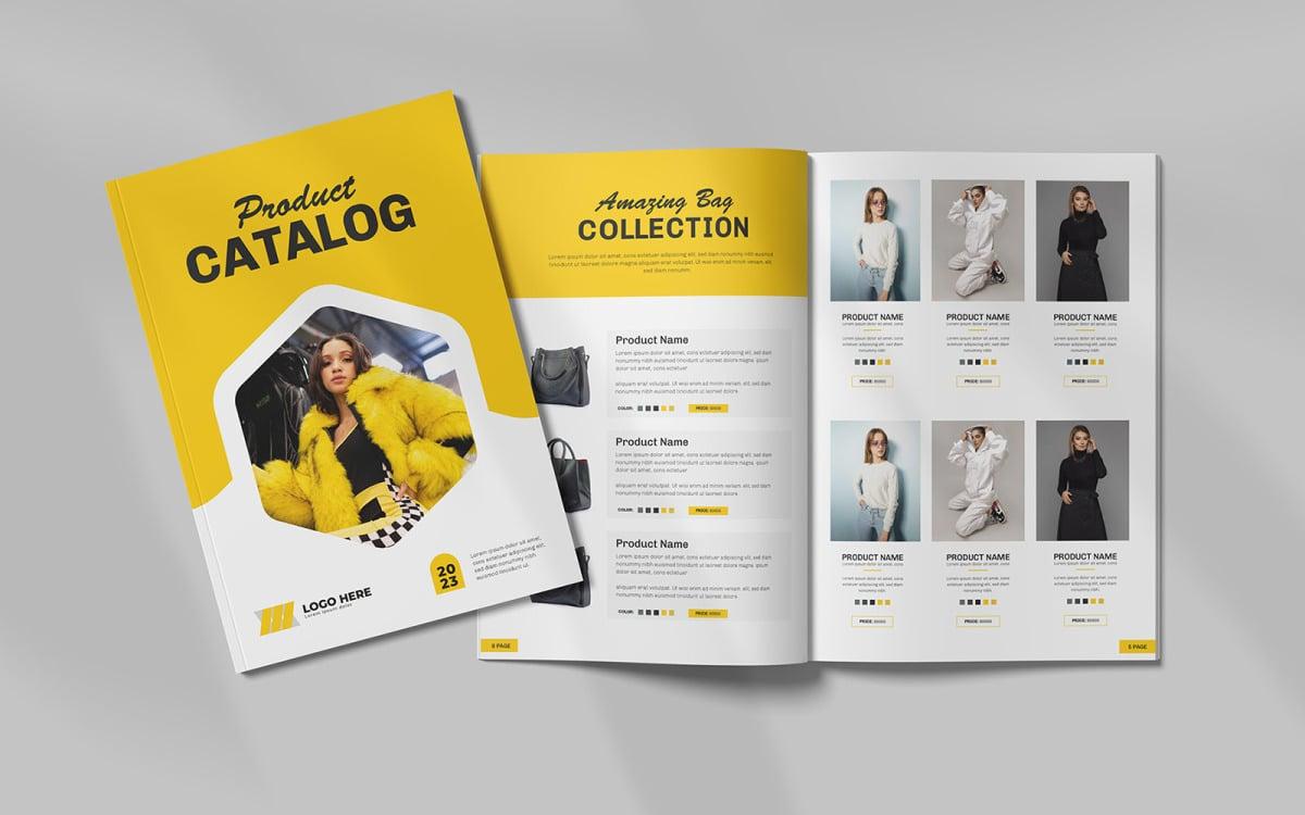
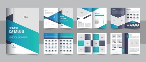
In the modern business world, a product catalogue is not just a product introduction document, but also a powerful marketing tool that helps build brands and attract customers. According to statistics,a beautiful and modern catalogue design can increase conversion rates by up to 30%,showing the importance of investing in this design.
An attractive, highly aesthetic catalogue will create a strong first impression, helping customers easily recognize and remember the brand. The choice of colors, layout and images must be suitable not only for the product but also for the core values of the company. From there, consumers will feel the professionalism and trust when deciding to shop.
Not only stopping at introducing products, the catalogue is also a place to showcase the brand story, the corporate culture, and the creative ideas of the design team. The quality of catalogue design is not only about the external appearance but must also convey the features, value, and benefits of the product to consumers. This affirms that a perfect catalogue design will help businesses create an emotional connection with customers..
So why has product catalogue design become an indispensable part of a business's marketing strategy? Precisely because in the current digital era, owning a standout and easily accessible catalogue will help businesses not only survive but also grow strongly. Therefore, in this article, I will analyze in more depth the essential factors for designing a beautiful and modern product catalogue, and at the same time offer methods to help businesses optimize this tool effectively.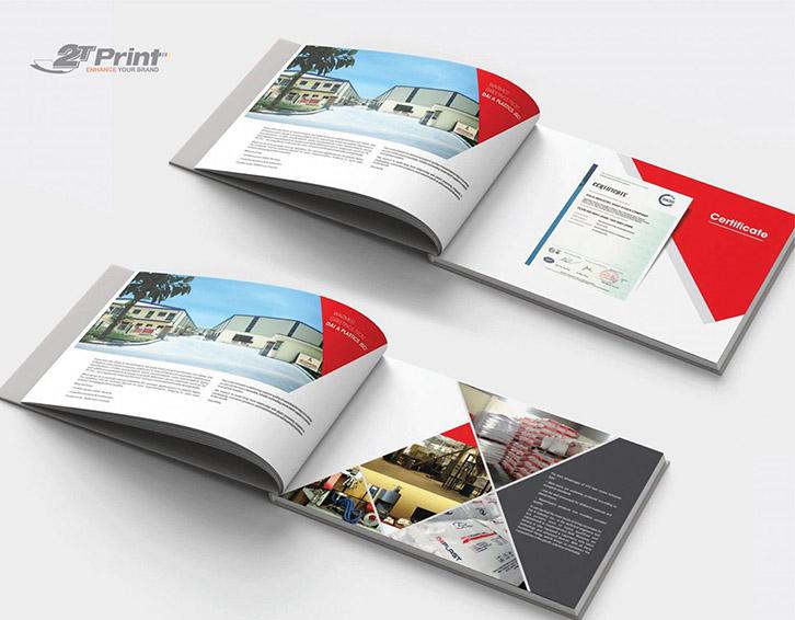
The art of product catalogue design in the digital age
Digital transformation in modern catalogue design
In the digital era, catalogue design is no longer simply about arranging product images and information mechanically. With 15 years of experience at DPS,I have noticed that catalogue design trends are shifting strongly with the integration of interactive elements and user experience. According to research by Nielsen Norman Group, 85% of customers decide to purchase based on their catalogue viewing experience, in which the most important factor is the interactivity and aesthetics of the design.
Principles of effective catalogue design
The key factors to creating an impressive product catalogue include:
- Creative layout with reasonable white space
- Consistent color system and typography
- High-quality product images
- Concise, easy-to-read product information
- Integrated QR code and augmented reality
| Design factor | Impact | 2024 trend |
|---|---|---|
| Dynamic layout | Increase 40% interaction | Flexible grid system |
| AR/VR | Increase 65% conversion | 3D product view |
| Typography | Increase 25% readability | Variable fonts |
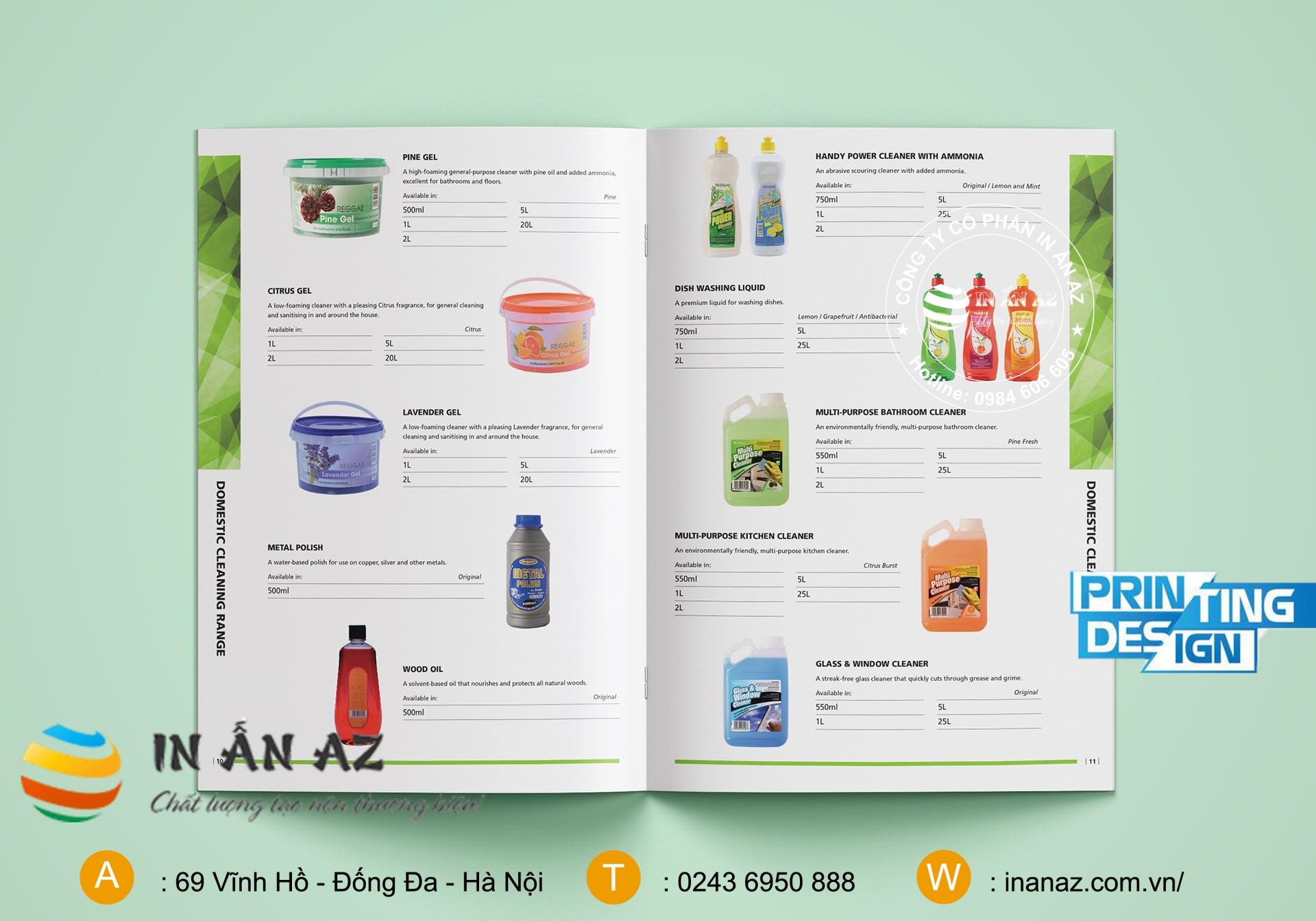
Key factors that create an impressive product catalogue
The art of combining aesthetics and information
According to research by the International Graphic Design Institute (IGDI), a successful product catalogue must ensure a perfect balance between aesthetics and information delivery. From experience implementing over 200 catalogue projects at DPS,I have found there are key factors that determine the success of a catalogue:
- Scientific layout: Arrange content according to a clear hierarchy model, creating highlights for main products
- Quality images: Use high-resolution photos, professional angles to showcase product features
- Consistency: Maintain consistency in color, font, and design style throughout
| Factors | Impact |
|---|---|
| White space | Increase reading comprehension 38% |
| Grid system | Enhance experience 45% |
| Color contrast | Elevate brand recognition 52% |

Principles of layout and color in modern catalogue design
The art of effective layout arrangement
Theo nghiên cứu của Tiến sĩ Robert Bringhurst trong cuốn “Teh Elements of Typographic Style”, một bố cục catalogue hiệu quả cần tuân theo nguyên tắc cân bằng thị giác và tạo điểm nhấn rõ ràng. Tại DPS, chúng tôi áp dụng the modular grid rule to ensure consistency and professionalism on every design page. This not only helps organize content systematically but also creates a smooth viewing experience for readers.
Professional color coordination in catalogues
Color theory is a key factor determining the success of a modern catalogue. Based on our design experience at DPS, we often prioritize:
- Using a color palette with a maximum of 3 main tones
- Applying the 60-30-10 rule in color distribution
- Creating emphasis with intentional contrasting colors
| Color style | Application |
|---|---|
| Monochromatic | premium, minimalist catalogue |
| Complementary | Dynamic, youthful catalogue |
| analogous | Fashion, cosmetics catalogue |
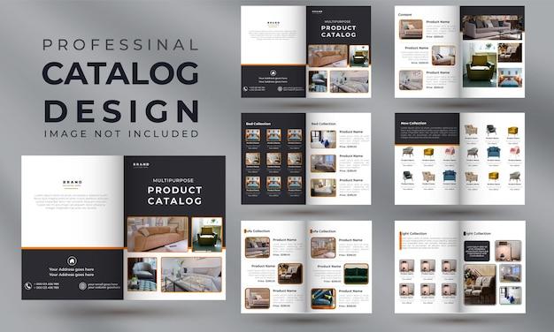
Breakthrough catalogue design trends in 2024
The combination of minimalist design and AR technology
The year 2024 witnesses the explosion of breakthrough catalogue designs the combination of minimalist style and augmented reality (AR) technology. According to research by the Stanford Design Institute, 78% of consumers said they were more impressed with highly interactive catalogues. At DPS, we have successfully applied this trend for many clients, notably the smart furniture catalogue project for ABC Company with over 50,000 QR code scans in the first two months after launch.
- Flat design combined with subtle color gradients
- Spacious layout focusing on the product
- Integrated QR code leading to AR experience
- Modern typography with sans-serif fonts
| Trend | Application rate |
|---|---|
| Minimalist design | 65% |
| AR integration | 45% |
| Asymmetrical layout | 38% |
Guide to choosing fonts and images for a professional catalogue
The importance of typography in catalogue design
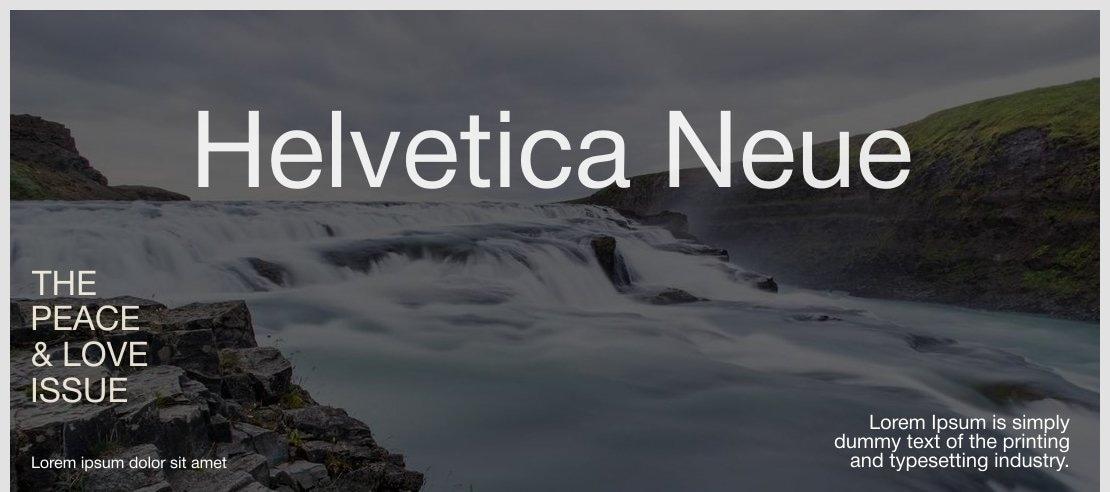
As a designer at DPS, I realize that font selection plays a decisive role in the success of a catalogue. According to research from Stanford University, readers take only 2.6 seconds to decide whether to continue viewing a publication, and 75% of this decision is based on their impression of the typography. I often prioritize using sans-serif fonts like Helvetica Neue or Gotham for headings, combined with serif fonts like Minion Pro for main content to create contrast and readability.
Optimizing professional product images
- Use images with a minimum resolution of 300 DPI for printing
- Ensure colors are calibrated to CMYK standards
- Áp dụng nguyên tắc bố cục “Rule of Thirds” cho ảnh sản phẩm
- Maintain consistency in shooting and post-processing style
| Font type | Recommended size | Application |
|---|---|---|
| Sans-serif | 24-36pt | Main heading |
| Serif | 10-12pt | Content |
| Display | 40-60pt | Cover page |
The preparation DPS makes for the next journey
With the knowledge and catalogue design techniques shared above, we believe you now have a solid foundation to start your creative journey. Remember, a beautiful catalogue is not just a collection of images and information, but also the brand story you want to tell your customers.
Don't hesitate to experiment and combine styles and colors to find the version that best fits your brand positioning. Keeping up with new design trends and learning from successful catalogue samples on the market will also help you continuously improve your product quality. If you want to learn more, you can refer to topics on layout principles, color psychology in design, or professional product photography techniques. This knowledge will help you comprehensively perfect your catalogue design skills.
We look forward to hearing your opinions and experiences during the catalogue design process. Please share the challenges you have faced as well as your creative solutions in the comments section below. Together, we can create more unique and effective catalogue designs.