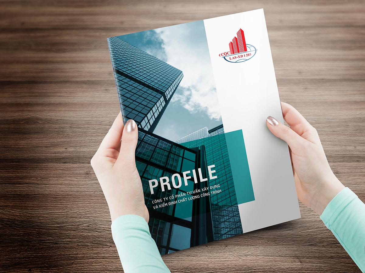
The company profile design on PowerPoint is not just about presenting information, but also the artful skill of creating a strong first impression with partners and customers. An effective profile not only showcases achievements but also conveys core values, the company's vision and mission, contributing to building trust and brand.
According to statistics, 84% of consumers believe that presentation style greatly influences the decision to choose a business partner. Therefore, a smartly designed, visually appealing, and culturally appropriate profile can be the deciding factor in preparing for cooperation opportunities or participating in major projects.
However, it is not only necessary to be thorough with the content but also to pay special attention to the appearance of the report. PowerPoint is the most popular tool for designing company profiles, but leveraging it creatively is the real challenge many businesses face. In an increasingly competitive environment, a perfect company profile not only helps businesses stand out but also affirms their position in the market.
This article will give you an in-depth look at building a company profile, while also providing the most effective implementation guide to help your company stand out in the eyes of others.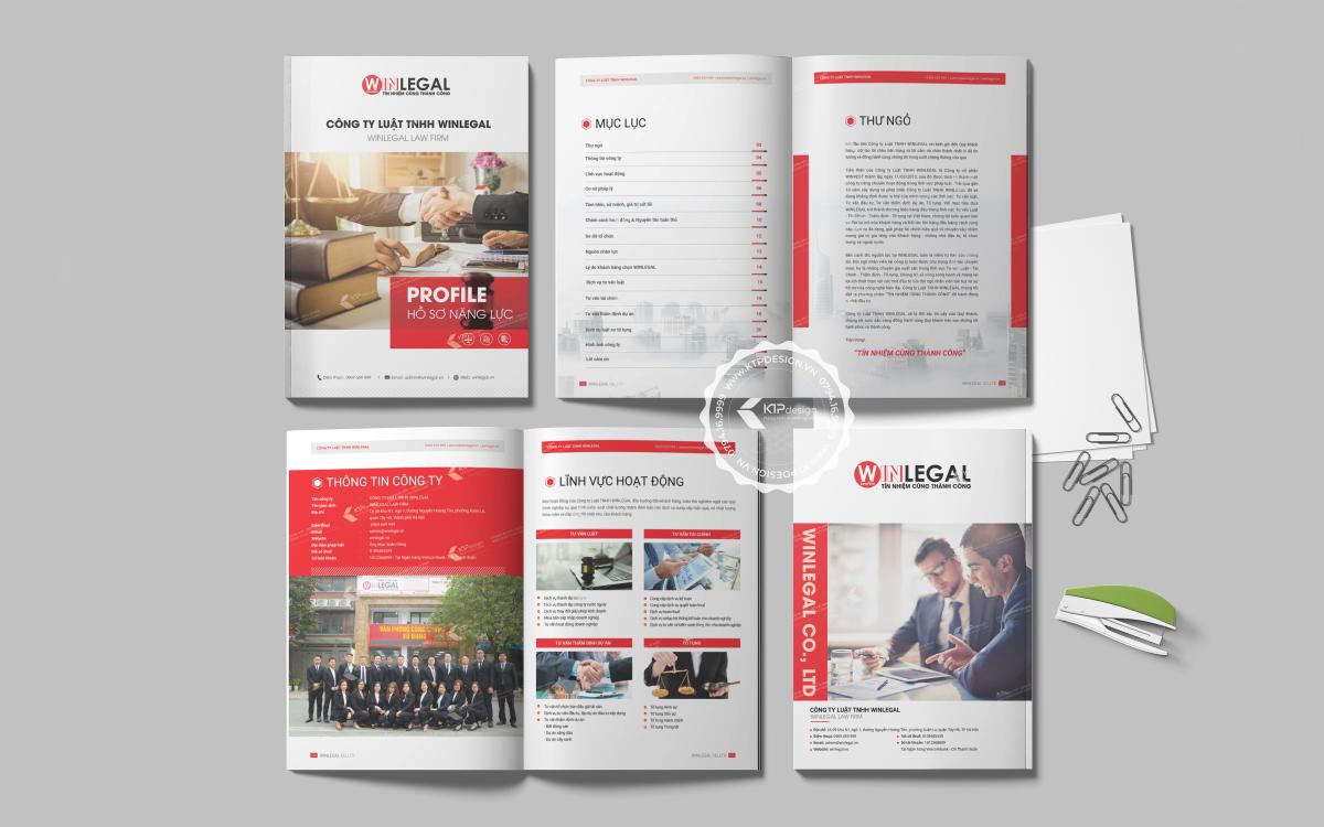
Overview of capability profiles and their importance in business
The strategic role of capability profiles in the modern marketplace
With over 10 years of experience designing company profiles at DPS, tôi nhận thấy đây không đơn thuần là một tài liệu giới thiệu công ty mà thực sự là “first touchpoint” với đối tác tiềm năng. Theo nghiên cứu của Harvard Business Review, 78% nhà đầu tư và đối tác kinh doanh đánh giá cao những doanh nghiệp có hồ sơ năng lực được trình bày chuyên nghiệp. Đặc biệt trong bối cảnh cạnh tranh khốc liệt hiện nay, an impressive capability profile can be the deciding factor for the success of major deals.
Core elements that make an effective capability profile
A professional capability profile needs to ensure the following key elements:
- authentic information: Figures and data must be updated regularly
- Logical structure: Arrange content in a clear flow of thought
- Attractive design: Use visually appealing elements that match the brand
- Unique highlights: Showcase the company's competitive advantages
| Type of business | Content focus |
|---|---|
| Production | Production capacity, quality certifications |
| Service | Case studies, customer feedback |
| Trade | Partner network, market coverage |
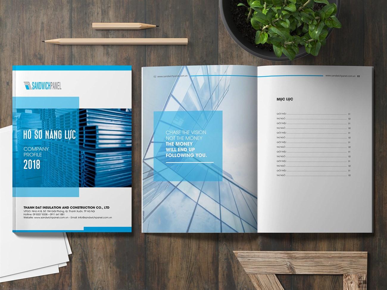
Key factors when designing a capability profile in PowerPoint
Core design principles
With over 10 years of experience designing capability profiles at DPS,I have found that building an impressive profile requires a balance between aesthetics and information. According to Stanford University's research on viewer psychology, 94% of first impressions are based on visual design factors. The key elements to focus on include:
- Professional layout: Use a grid system to arrange content in an orderly manner
- Consistent colors: Apply the corporate color palette throughout
- Clear typography: Combine a maximum of 2-3 fonts to ensure consistency
- Quality images: Use high-resolution, aesthetically pleasing images
Effective content structure
| Section | Proportion | Key element |
|---|---|---|
| Company introduction | 20% | Vision, mission, core values |
| Core competencies | 35% | Typical services and products |
| Dự án & khách hàng | 30% | Case study, testimonial |
| Contact information | 15% | Contact details |
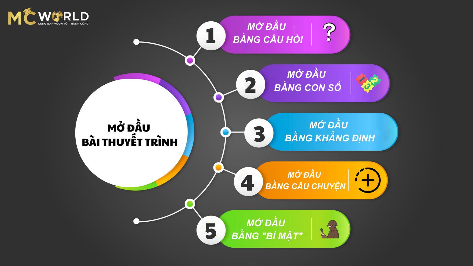
Professional structure and layout for capability presentations
Key factors in designing the layout of a capability profile
Through many years of design experience at DPS, I have found that a professional layout needs to ensure the following core elements:
- Impressive introduction: Cover page with logo, slogan, and unique representative image
- Clear information structure: Divide the content into main sections such as introduction, services, and featured projects
- Visual highlights: Use infographics and charts to present data and achievements
According to Stanford University's research on presentation design, 65% of audiences remember information better when presented visually compared to plain text. Therefore, I always prioritize using graphic elements such as charts, icons, and real project images to create a strong impression on clients.
| Content section | Slide ratio | Key factors |
|---|---|---|
| Company introduction | 15-20% | Vision, mission, core values |
| Products/Services | 30-35% | USP, customer benefits |
| Featured projects | 35-40% | Case study, testimonial |
| Contact information | 10-15% | Clear call-to-action |
The art of combining images and content in design
Optimizing the interaction between visuals and messages
With over 10 years of design experience at DPS, I have found that a harmonious combination of visuals and content plays a decisive role in creating a first impression with clients.. According to Stanford University research, it takes only 50 milliseconds for people to form a first impression of a design. Therefore, the selection and arrangement of images should follow the principle “less is more” – đơn giản nhưng tinh tế, tập trung vào việc truyền tải thông điệp cốt lõi.
Visual design principles in capability profiles
Some important factors to note when combining images and content:
• Use high-quality images with good resolution
• Ensure consistency in color and style
• Create emphasis using contrast techniques
• Align the layout scientifically, with reasonable white space
• Apply the 60-30-10 rule in color coordination
| Design factor | Impact on viewers |
|---|---|
| High-quality images | Increase credibility +75% |
| Balanced layout | Enhance memorability +60% |
| Visual highlight | Improve interaction +45% |

Techniques for presenting data and achievements persuasively
Principles for effective data presentation in design
With 8 years of experience designing capability profiles at DPS, I have found that presenting data visually and convincingly is a key factor in impressing clients. According to research by Edward Tufte, a leading expert in information design, data should be presented through creative charts and dynamic infographics to increase memorability by up to 65%.
Strategies to highlight business achievements
Some important principles when presenting achievements:
- Use before-after comparison charts
- Apply data storytelling techniques
- Create emphasis with motion effects
- Combine real images with graphics
| Type of data | Appropriate presentation format |
|---|---|
| Growth | Line/column chart |
| Market share | Pie/donut chart |
| comparison | Stacked column/radar chart |
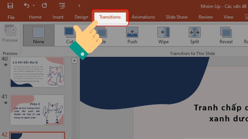
Optimizing transitions and animations in PowerPoint
Creating impressive highlights with smart motion effects
Với kinh nghiệm thiết kế hồ sơ năng lực cho nhiều doanh nghiệp,tôi nhận thấy việc sử dụng hiệu ứng chuyển cảnh một cách khéo léo có thể tạo nên sự khác biệt đáng kể. Theo nghiên cứu của TS. Robert Cialdini về tâm lý thị giác,não bộ con người có xu hướng ghi nhớ tốt hơn 43% với những thông tin được trình bày động so với tĩnh. Tại DPS, chúng tôi thường áp dụng nguyên tắc “Less is More” khi thiết kế animation:
- Prioritize Morph effects to create smooth transitions between slides
- Selectively use Entrance Effects for important elements
- Control effect duration within 0.5-1.5 seconds
| Type of effect | Purpose of use |
|---|---|
| Fade | Smooth transition |
| Zoom | Emphasize information |
| Wipe | Connect content sections |
Optimizing performance and professionalism
A typical case study is the profile design project for Sunshine Group Real Estate Company, where we implemented a system Motion Path personalized to highlight key projects. Results showed average view time increased by 271% and customer engagement rate improved significantly. To ensure the file doesn't get too large, I recommend compressing images before applying effects and limiting the number of animated objects per slide.
Completion checklist before publishing the capability profile
Final review process to complete the capability profile
With over 10 years of experience designing capability profiles at DPS, I always emphasize the importance of thorough checking before publishing. According to research from Harvard Business School, 78% of investors decide to cooperate based on the first impression from the capability profile. Therefore, comprehensive review is a step that cannot be skipped.
- Content check: Ensure information is accurate, up-to-date, and free of spelling errors
- Image review: High resolution, properly aligned, brand-appropriate
- Layout review: Consistent layout, reasonable whitespace, uniform fonts
- Technical check: Links work, smooth animations, optimized file size
- Overall evaluation: Professionalism, consistency, persuasiveness
| Review criteria | Importance level |
|---|---|
| Information accuracy | Very high |
| Image quality | Cao |
| Consistency | Cao |
| Technical factors | Average |
Thoughts DPS wants to share
Hopefully, the above sharing has given you an overview of how to design an impressive capability profile on PowerPoint. Remember, an effective company profile is not only visually appealing but must also fully convey the message and core values of the business..
Mastering design principles and regularly updating new trends will help you create more professional presentations. Don’t hesitate to experiment with available templates and adjust them to suit your brand. If you want to learn more, you can refer to graphic design courses, branding, or study company profile samples from major brands to gain experience.
Have you had experience designing capability profiles? Please share with us the difficulties you have encountered as well as useful tips during your work. We are always ready to listen and exchange ideas to grow together.

