In the ever-evolving world of the tourism industry, catalog design is not just about compiling information, but also an art of creating a connection between destinations and travelers' desires. An impressive travel catalogue can become a bridge, turning people's dreams and exploration plans into reality.
According to statistics, 60% of travelers decide their journey just from visually guided publications. This shows that a catalogue not only carries informational value but is also a powerful marketing tool. Skillfully combining colors, images, and language can convey emotions, creating engagement from the very first glance to the reader's hands.
The topic of catalogue design in the tourism industry is not just a matter of graphic design but also opens up a debate on how to represent the culture, people, and nature of a region through the pages. With the increasing amount of information and competition in this industry, the uniqueness of a catalogue will greatly determine the success in attracting customers and building a brand.
This article not only brings you impressive catalogue samples but also deciphers the design methods to touch the soul of every traveler. Each design has its own story, and I hope that through these in-depth analyses, you will find inspiration for your own project.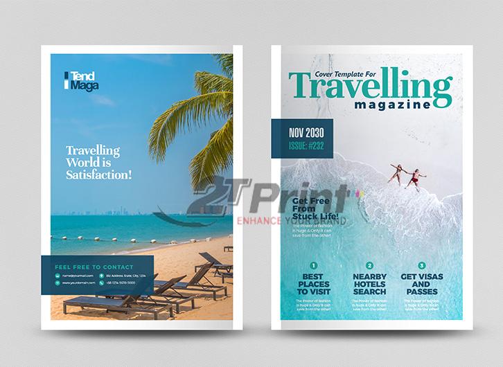
modern and captivating travel catalogue design trends
Innovate design style with creative layouts
Travel catalogue templates are strongly shifting towards a more minimalist and sophisticated direction. Creative layout with white space đang là xu hướng được ưa chuộng, giúp nội dung và hình ảnh “thở” tự nhiên hơn. Theo khảo sát của Nielsen Norman Group, 78% người dùng đánh giá cao các thiết kế catalogue có không gian trống hợp lý. Tại DPS, chúng tôi thường xuyên áp dụng nguyên tắc này vào các dự án, đặc biệt là với case study gần đây cho Vietravel – một trong những đơn vị lữ hành hàng đầu Việt Nam.
Optimize experience through visual elements
- Using high-quality images, minimum resolution of 300dpi
- Harmoniously combining panoramic and detailed photos
- Creating highlights with modern photo manipulation techniques
- Applying diverse layouts: split layout, full-width imagery
| Trend | Popularity level | Visual effectiveness |
|---|---|---|
| Minimalism | 85% | Cao |
| Dynamic Grid | 75% | Average |
| 3D Elements | 60% | Very high |
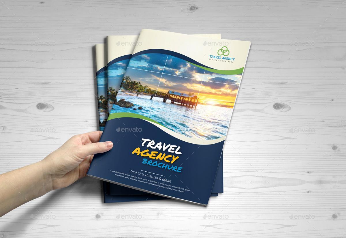
essential elements for a professional travel catalogue
Key factors that create appeal for a travel catalogue
With over 10 years of experience designing for travel businesses, I have found that a professional travel catalogue needs to meet the following key factors:
- High-quality images: Use images with a minimum resolution of 300dpi, professionally shot with unique angles
- Scientific layout: Arrange information in a logical order from overview to tour details
- Harmonious colors: color schemes suitable for the characteristics of each region and destination
- Concise content: Clear and succinct writing style but fully informative
| Factors | Impact |
|---|---|
| High-quality images | Increase 70% customer attraction capability |
| Scientific layout | Helps customers easily find necessary information |
| Harmonious colors | Create a strong visual impression |
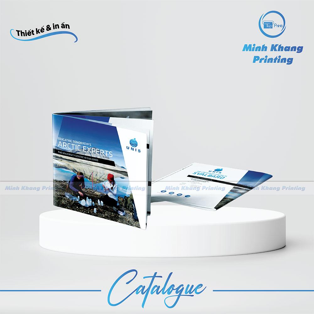
How to combine images and content in the travel catalogue industry
The art of optimizing image and text layout
The harmonious combination of images and content in a travel catalogue requires careful consideration of proportion and layout position. According to research by Cornell University on visual psychology, readers typically spend 70% of their initial time observing images before reading text. Therefore, I always prioritize using high-quality photos of destinations, placing them in prominent positions such as the top left corner or the center of the page. The text content should be arranged around, creating balance and naturally guiding the viewer.
- 60/40 layout rule: 60% of the area for images, 40% for content
- Use white space: Tạo khoảng trống để nội dung “thở”
- Apply grid system: Ensure consistency in layout
| Image type | Recommended size | Optimal position |
|---|---|---|
| Panorama image | 1920x1080px | Header/Footer |
| Destination image | 800x600px | Page center |
| Detail image | 400x300px | Alternating with text |
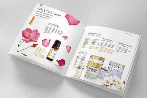
Tips for choosing layouts and colors to create highlights for catalogues
Effective layout and color coordination principles for travel catalogues
With over 10 years of design experience at DPS,I have found that arranging the layout of a travel catalogue should follow the principle “less is more”. Một catalogue hiệu quả thường được chia thành các phần rõ ràng với white space hợp lý, giúp nội dung “thở” và dễ tiếp nhận. Theo nghiên cứu của Color Marketing Group, 85% khách hàng quyết định mua hàng dựa trên màu sắc, vì vậy việc chọn bảng màu phù hợp đóng vai trò quyết định.
- Ưu tiên sử dụng màu xanh dương và xanh lá – tượng trưng cho biển và núi
- Combine with neutral tones like beige and light brown to create a luxurious feel
- Highlight with orange and red to draw attention to offers
| Layout type | Advantages | Suitable for |
|---|---|---|
| grid layout | Neat, easy to follow | Short-day tour |
| Magazine style | lively, attractive | Premium tour |
| Minimalist | luxurious, professional | Resort & Spa |
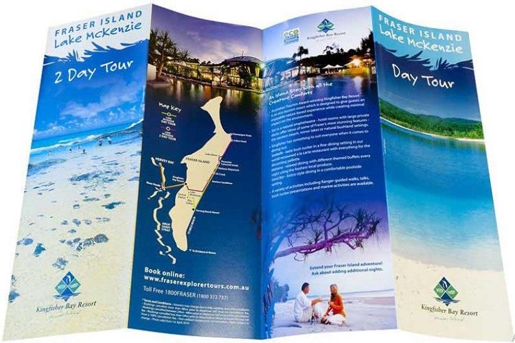
Unique travel catalogue design samples from around the world
Breakthrough travel catalogue design trends
Through research and analysis of outstanding travel catalogue samples worldwide, I found that many unique designs have created their own distinctive marks. according to a survey by the Travel Marketing Association, 78% khách hàng bị thu hút bởi những catalogue có yếu tố đột phá về hình ảnh và bố cục. Điển hình như mẫu catalogue của Tourism New Zealand với concept “pop-up book” độc đáo,hay thiết kế minimalist tinh tế của visit Sweden đã nhận giải thưởng thiết kế Cannes Lions 2022.
- Using augmented reality (AR) technology
- Applying embossed printing and exquisite laser cutting techniques
- Integrating smart QR codes for multi-platform connectivity
- Interactive design with readers through folding mechanisms
| Design style | Application trends | Preference rate |
|---|---|---|
| Minimalist | Europe, Japan | 45% |
| 3D pop-up | USA, Australia | 30% |
| Interactive | Global | 25% |
DPS's perspective in the story
With the above sharing, we hope you have gained more ideas and inspiration to design your own impressive travel catalogue. Remember, a beautiful catalogue is not only about appearance but also needs to convey the story and emotions of the destination..
Don't hesitate to experiment with new design styles, combine different creative elements to create your own unique publication. Referring to the latest design trends and learning from successful catalogue samples will help you continuously improve your skills. If you want to learn more, you can also explore topics on travel photography, typography in design, or the art of storytelling through images. This knowledge will help you perfect your travel catalogue design.
Share with us the catalogue samples you have designed or your unique ideas in the comments section! We look forward to hearing new perspectives and exchanging experiences with you all.