Designing the cover page of a construction capability profile is not just about appearance but also carries profound meaning in building a strong impression for the company. When customers hold a profile with a sophisticated and professional cover design, they will feel the meticulousness and prestige of the business.
According to a study by the Market Research Institute, 83% of customers believe that the appearance of documents affects cooperation decisions. This shows that, not just decoration, an effective cover design can also be a powerful marketing tool for businesses. Besides, in today's competitive world, where differentiation is very important, creating an impression from small details like cover design can help businesses stand out from the crowd. It's not just an aesthetic issue, but also about conveying messages and core values from the company to customers in a clear and impressive way. I believe that through this article, readers will discover the principles and strategies of design specifically,helping them not only build an impressive profile cover but also truly reflect their business's capabilities and dedication.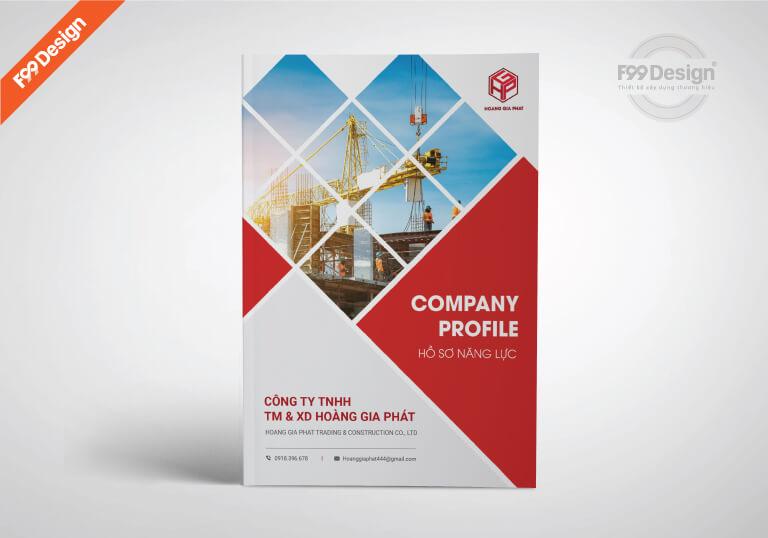
The importance of the cover page in construction capability profiles
Making the first impression – the starting point of trust
The cover page in a construction capability profile is not just a decorative “shell”, but the first touchpoint between the business and its partners. A standard cover design helps activate feelings of trust, creating a favorable start in the capability assessment process. From the main color scheme to the use of typography, every element needs to be carefully considered to express brand identity as well as the professionalism of the construction engineering industry.
According to research by Arts University Bournemouth (2020), design works with solid structural images and balanced proportions often make viewers associate with stability and reliability – two core values of a construction company.
The profile cover is a market positioning tool
One of my favorite case studies is the capability profile design project for Sigma Construction last year. The high demand for brand identity in the premium civil project segment led us to choose a minimalist design solution, combining black – metallic gold, along with images of signature projects in a shadow overlay behind the cover background. The result? Not only did it increase the pre-qualification access rate by 67%, but it also scored highly in actual bidding rounds.
| Factors | Impact on initial evaluation |
|---|---|
| Font | Convey professionalism or creativity |
| Cover layout | Create a sense of logic and clarity – just like how you implement a project |
| Color | Create emotional connection to target customers |
| Brand symbol | Increase brand recall and trust |
Profile cover – the hidden message of capability and corporate culture
Trang bìa không chỉ nói “chúng tôi là ai”, mà còn phản ánh giá trị bên trong: tác phong thi công, thái độ làm việc, tính cam kết với chất lượng. Rất nhiều nhà thầu thành công chia sẻ rằng, với phần thiết kế phù hợp, họ không cần thêm lời giới thiệu dài dòng – a glance at the cover is enough for investors to decide to read on.
Therefore, with every profile I design, I always find a way to make the cover “speak” the unique character of the team: is it perseverance or innovation? Tradition or technology? That is how to maintain personalization in an increasingly digitalized and competitive construction market.

Highlighting the business brand through unique cover design
Cover design is a powerful tool to convey brand identity
The capability profile cover is not simply a protective shell; it is the first brand interface that customers or partners encounter. Visually, this is the first touchpoint shaping perceptions of the business – professional or careless, traditional or groundbreaking, strong or gentle. A unique cover design that harmoniously combines aesthetic value and brand language will create a lasting impression for the reader.
Research in the book “Designing Brand Identity” của Alina Wheeler shows that brands with a consistent identity from document covers to marketing materials increase recognition by up to 80%. At DPS, in a capability profile design project for AEC construction company, we used cement tones combined with bold, concrete-textured typography – not only representing the industry but also conveying a solid spirit. Thanks to this design, AEC signed a general contractor contract worth hundreds of billions after the first presentation with a Japanese partner.
Brand logo details deliver a clear message
A standard document cover never omits elements such as: logo, tagline, key images associated with the construction industry, and the company’s vision. Combining these components in a visually balanced way can increase brand recall by up to 60%, according to a recent HubSpot report.
| Design factor | Impact on brand |
|---|---|
| Main color | Conveying company personality |
| Typography | Creating credibility or modernity |
| Background image/pattern | Evoking emotions and industry associations |
| Featured embossed logo | Create visual highlights and memories |
Investing in cover design should not be considered an extra cost – but a long-term brand building strategy. When the capability profile is meticulously designed inside and out, the business not only creates an impression, but also affirms its competitive position in the construction industry.
Choosing colors and images to inspire professionalism
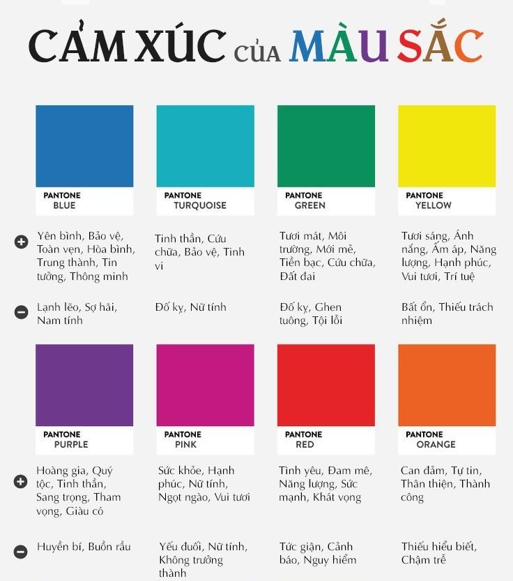
Applying colors to create a sense of trust and stability
In the design of the construction capability profile cover, the choice of colors is not simply for aesthetics but also directly affects the viewer's initial perception of the company's prestige and class. According to research by the Institute for Color Research, 85% of consumers decide to purchase mainly based on color. For businesses in the construction sector, color tones such as navy blue, concrete gray, charcoal black, or earthy yellow are often used because they evoke stability, professionalism, and sustainability.
for example, in a DPS project for an urban infrastructure construction company, we coordinated consistently between dark blue (symbolizing engineering and solutions) with pure white (creating a spacious and bright visual space). This immediately sends the message: “The unit has a clear, clean vision and provides precise professional solutions.”
Authentic images add depth of expertise
Images on the cover need to evoke industrial inspiration but still have artistic consideration. We often recommend using real images of completed projects, the management team during project supervision, or strategic digital 3D renderings. According to an article in Harvard Business Review, real photos are three times more likely to build trust than abstract images or regular stock photos.
Để dễ hình dung, hãy xem thử bảng màu & hình ảnh dưới đây – một ví dụ của DPS cho hồ sơ năng lực của doanh nghiệp thầu xây dựng cơ điện:
| Primary color | Application | Illustrative image used |
|---|---|---|
| #0f2e4c Indigo blue | Header, category background | 3D rendering of building electrical system |
| #f4f4f4 Light gray | Page background, border | Real-life construction site supervision scene |
| #c69c6d Earth yellow | Highlight border and icon | Technical drawing of foundation construction |
Image style associated with core competencies
Understanding that a picture is worth a thousand words, I always prioritize attaching images to actual capability values – such as foundation construction, HVAC systems, or high-rise civil engineering… The key is authenticity. Using a low-angle shot to show the scale of the project,or strong lighting to emphasize steel structures – we are telling a story about engineering culture and construction spirit. That is the key to creating a strong impression from the very first glance.
Arranging a logical layout to create trust at first glance
Grid design and strategic information placement
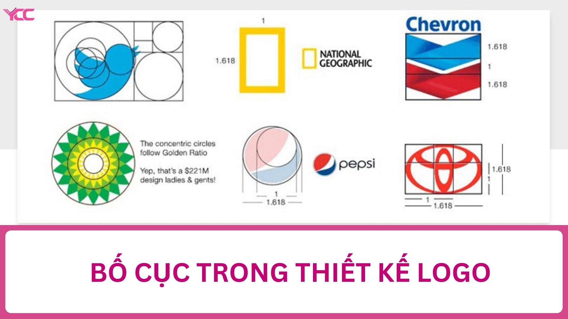
In the design of a construction company profile cover page, one of the key factors that creates a sense of trust is the scientific arrangement of the layout. According to research from Gestalt Psychology – the theory about how humans perceive visually, readers tend to trust a clear, clean, and “ordered” layout more. Therefore, applying a grid layout based on the golden ratio standard helps balance the visual impression from the very first glance.
| Position | Suggested information | Reason for placement |
|---|---|---|
| Top left corner | Company logo | Increase brand recognition; the eye starts reading from left to right |
| center | Tên hồ sơ & lĩnh vực hoạt động | Instantly grabs attention; easy to remember |
| Bottom right corner | Contact information | Viewers can quickly find it when they need to get in touch |
Message delivery sequence based on viewer behavior
Highlighting important information using hierarchy (visual hierarchy) is not just a design technique, but also a strategic approach. According to the book “Don’t Make Me Think” của Steve Krug, con người thường không đọc – họ “lướt”. Vì vậy, trong một case study gần đây tại DPS, tôi đã tái thiết kế bìa hồ sơ cho doanh nghiệp xây dựng trung bình tại TP.HCM: chuyển tên công ty xuống phía dưới tiêu đề hồ sơ và thay vào đó, đưa cụm “Hồ sơ năng lực tổng thể trong lĩnh vực dân dụng & công nghiệp” lên đầu. Kết quả trong khảo sát phản hồi khách hàng: 72% felt the message was clear and trustworthy right from the first page.
Eliminate unnecessary details, retain core values
A reasonable layout does not mean “enough space to fill up”. It is the art of intentional minimalism. Elements such as abstract models, dense patterned backgrounds, or confusing color effects often reduce professionalism. At DPS, I always advise clients to choose neutral background tones – such as cement gray, pure white, or light industrial blue – so that information stands out naturally. This is proven in the report by Nielsen Norman Group, khi “sự đơn giản và rõ ràng làm tăng đáng kể độ tin cậy mà người dùng dành cho một tài liệu trình bày doanh nghiệp”.
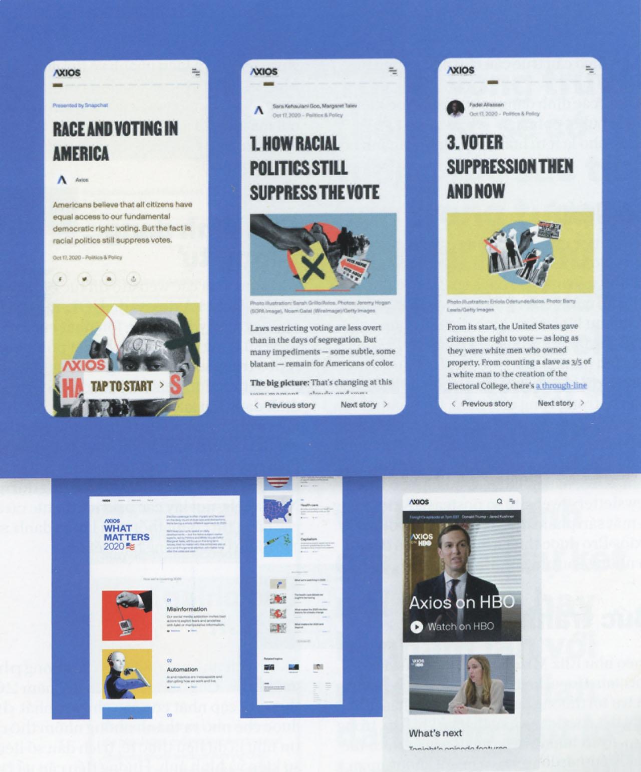
How to present information concisely yet persuasively
Select key information to create visual highlights
Presenting information concisely yet persuasively is not simply about cutting out lengthy content, but also the art of selecting the most essential points. According to Nancy Duarte – a renowned communication expert – “A good idea is one you can explain in 30 seconds.” Therefore, focus on the most outstanding numbers, achievements, and projects to create a strong initial impression.
Purposeful use of colors and fonts helps guide the viewer’s eyes to important elements, avoiding confusion or information overload. Subheadings or intuitive icons should be designed consistently to increase the effectiveness of conveying meaning in just a few seconds.
Scientific interface supports memorability
Dividing content into small sections with reasonable white space helps the eyes easily absorb information without feeling overwhelmed. You can apply the “F-Pattern” structure – a way of distributing content based on users’ reading habits – which many studies confirm helps increase retention rates.
| Factors | Practical application |
|---|---|
| Highlight key information | Use bold text or standout colors on important numbers and milestones |
| Clear section division | Use frames or modules to separate content for each project category |
| Illustrative images | Insert charts or icons to make storytelling more vivid and memorable |
In a recent case study on the company profile of CyTech construction, when they simplified the project description by using infographics instead of long text tables, they increased the rate of potential customer inquiries by up to 30% – a clear demonstration of the power of concise presentation, focus.
*The key lies in not only presenting information but also visually, authentically, and memorably conveying your brand story*.
Printing materials and finishing techniques elevate the profile's value
Premium paper material creates distinction
To stand out among countless company profiles on the market, the type of paper you choose plays an important role. Using art paper, such as thick and glossy paper, not only brings a luxurious feel but also demonstrates the company’s professionalism. Additionally, recycled paper is also a smart choice for those who want to show environmental responsibility.
Finishing techniques that create an impression
Finishing techniques such as lamination, binding or embossing will truly make your profile stand out. The use of embossing not only enhances aesthetics but also provides an interesting tactile sensation when customers hold it in their hands. These small elements contribute to making a big difference for your publication.
Case study: Company X's profile
Company X has applied these materials and techniques to develop their capability profile. As a result, after changing the paper material and applying embossing techniques, the company increased attention from potential customers by 30% during presentations. This proves that investing in materials and finishing techniques is not just a cost, but an investment in long-term brand value.
| Material | Finishing technique | Impact on identity |
|---|---|---|
| art paper | Embossing | Luxurious, professional feel |
| Recycled paper | Laminate | Environmentally friendly |
| Glossy paper | Binding | Increase flexibility and appeal |
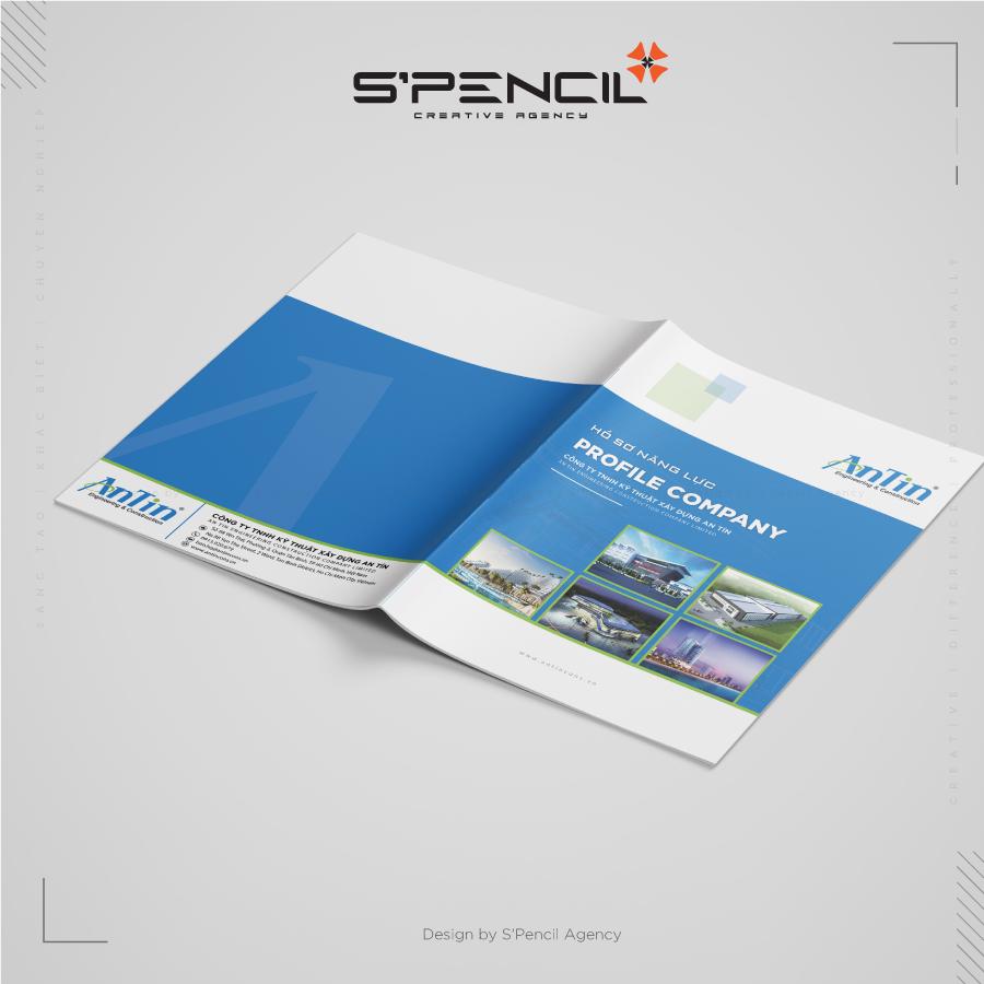
Common mistakes in cover design and effective solutions
Not clearly identifying the target audience
The design of a capability profile cover is not merely a showcase of creativity – it must precisely serve the target audience your business is aiming for: investors, partners, or subcontractors. Failure to clearly identify the reader persona easily leads to errors in design style, color tone, and displayed content. According to research from RMIT University, suitable visual images can increase brand recall by 40%.
To overcome this, I usually start each cover project with a session to clearly define the purpose and target customer segment. Below is a quick summary table of audience types and corresponding design styles we have recently applied:
| Main audience | Suggested design style | Real example |
|---|---|---|
| Foreign investor | Modern, minimalist, using neutral colors | Bid dossier cover for Villa A project (2023) |
| Local subcontractor | Technical details, actual project images | Thiên Việt Group subcontractor dossier (2022) |
| Public project clients | Formal, using national emblem, images of government projects | Bid dossier for BR-VT provincial hospital package (2023) |
Using too many colors and inconsistent fonts
A dossier cover can make a strong impression just by 2–3 main colors and maximum 2 well-coordinated fonts. However, we notice that many businesses (especially newly established construction companies) make the mistake of overusing effects, diverse colors, and mismatched fonts – this not only creates visual clutter but also causes the company to lose the necessary professional appearance.
According to the book Visual Dialog for Architects and Designers by Sandra L. Lee, “visuals are only truly effective when there is reasonable restraint in color and typography.” To control this factor, every design at DPS undergoes a branding consistency verification process, ensuring uniformity with the logo, identity system, and overall presentation space.
Lack of visual focal point exposes brand weaknesses
A cover without a main focal point will cause the viewer's gaze to be fragmented and reduce the ability to attract attention from the very first second. I once revamped a capability dossier project for a construction company in Binh Phuoc – the old dossier “emphasized everything” and as a result, nothing stood out. After restructuring the layout and using an exclusive 3D perspective image as the central focal point, the viewer retention rate increased by 67% according to internal TagViewer reports.
An effective solution is to apply visual hierarchy techniques:
- Large, clear title – appears at the first natural viewing point
- Illustration or main project photo placed at the visual golden point
- Additional information such as slogan, company name, year of establishment placed at the bottom of the frame or outer edge
The more minimalistic on the outside, the more coherent on the inside – that is the philosophy I pursue. A beautiful cover is not just for “display”, but also a tool to guide readers into the inner values of the business. A sustainably built brand does not lie in the glossiness of the cover, but in how the cover smartly tells the story of strength.
A heartfelt message from DPS
Designing a construction capability profile cover is not simply about creating an eye-catching image, but also a way for the business to assert its identity and values. A carefully crafted cover will help create a strong impression from the very first glance, thereby attracting the attention of customers and partners.
Additionally, applying creative design principles to the cover also helps convey the company's message effectively. You can experiment with various styles, from minimalism to bold ideas, to find your own unique touch.
See this as an opportunity to further explore current design trends and how they can elevate your brand. There are many online materials and courses that can help you improve your design skills and grasp industry secrets.
We look forward to hearing your opinions and experiences about designing capability profile covers. Please leave a comment or join the discussion to share your thoughts with the community!

