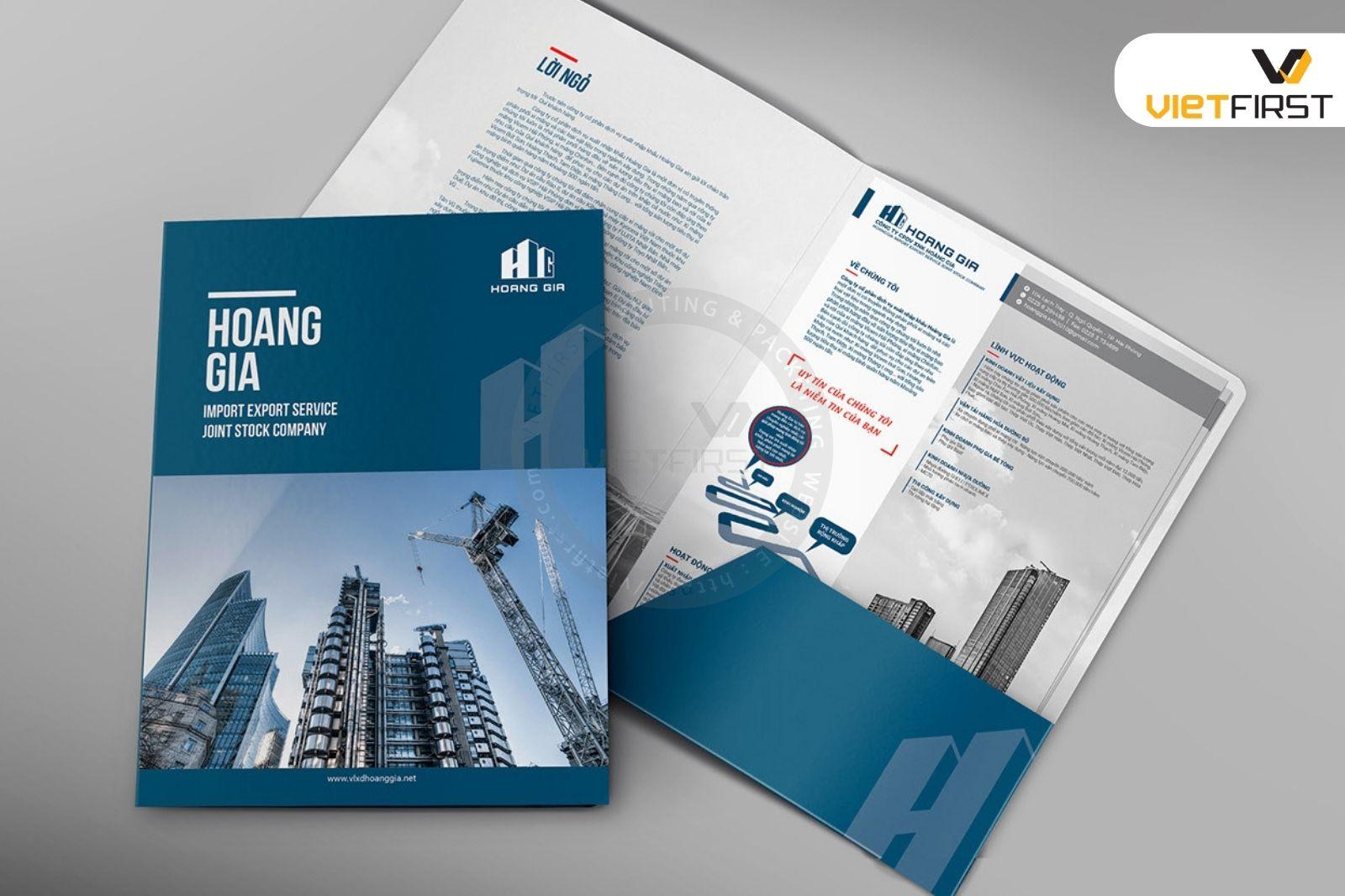
A beautifully designed company profile not only presents information – it inspires and builds trust. The first impression often determines 80% of a business's cooperation opportunities, and in a competitive market, visual differentiation is a strategic advantage.
As someone who has had the opportunity to observe and participate in building dozens of profiles for businesses of all sizes, I, Hiển, have realized that: great content is not enough; smart, distinctive presentation is also needed. Một hồ sơ được chăm chút về thiết kế giúp khách hàng hình dung ngay được “chất” của doanh nghiệp, từ đó tăng khả năng ghi nhớ và kết nối.
Tuy nhiên, nhiều doanh nghiệp lại xem nhẹ thiết kế, hoặc bị cuốn vào lối mòn “đẹp kiểu chuẩn mực”, thiếu điểm nhấn và chiều sâu. Đây là nơi thiết kế không còn là công cụ trình bày,mà trở thành một brand language gateway,opening up opportunities for the business story to be told in a lively and persuasive way..
Bài viết này sẽ phân tích những yếu tố cốt lõi để tạo nên một hồ sơ năng lực ấn tượng từ góc độ thiết kế – sự kết hợp giữa thẩm mỹ, chiến lược nội dung và tâm lý thị giác. Đây không chỉ là vấn đề về “trông cho đẹp”, mà là the art of conveying value visually, an essential skill in the era of brand dominance.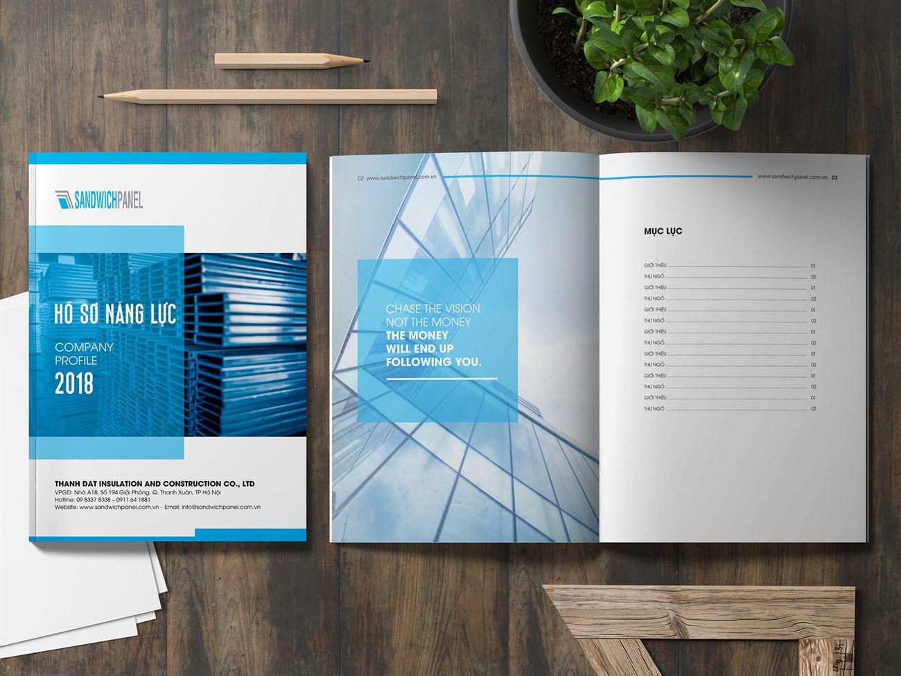
The importance of profile design in shaping brand image
Make a strong first impression with professional design
Khi đối tác hoặc khách hàng lật giở từng trang trong hồ sơ năng lực, đó là khoảnh khắc thương hiệu được “trình diện”. Giống như lý thuyết “first impression” trong tâm lý học (Solomon, et al., 2012), một hồ sơ năng lực được thiết kế chỉn chu, nhất quán, demonstrates the ability to organize images and information coherently, creating a professional impression from the outset.A sketchy or cluttered design easily leads partners to underestimate your capabilities, no matter how good the content is.
- Clear layout: guides the viewer's eyes and helps them avoid confusion.
- Consistent colors and fonts: reflects brand identity.
- Real, high-quality images: increase credibility and emotion.
Build brand identity from the inside out
Wally Olins“ research shows that a brand is not just a ”logo + slogan”, but a series of continuous touchpoints from the way you speak, to the written content, and even the presentation. Therefore, a company profile is not simply a business introduction – it is an inseparable part of the brand communication ecosystem.
Let's look at a case study: During a time when the DPS team redesigned the profile for ANYS company, we completely shifted the layout from traditional to data-driven storytelling – the results were truly impressive.. Not only did it help them sign a million-dollar project with a Korean partner, but it also elevated their image standards on B2B platforms like LinkedIn and Behance.
Compare the effectiveness between regular and professional profile design
| Criteria | Standard profile | Professional design |
|---|---|---|
| Reader retention time | < 30 giây | 1 – 2 minutes |
| Brand recall ability | Low | Cao |
| Positive response rate | 18% | 46% |
| Brand image consistency | Unclear | Guaranteed |
Essential elements to create a beautiful and professional profile
Consistent brand image and sophisticated visual design
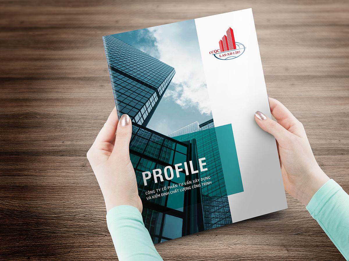
An impressive company profile is indispensable brand identity is clearly expressed: logo, colors, fonts, and layout proportions must all be consistent with the identity system. I once encountered a case where a major client in the construction industry—their old profile used up to three different font styles and inconsistent color tones. After redesigning, simply by maintaining the main blue-gray color throughout and combining it with a minimalist grid layout, the B2B client group found it much easier to remember the brand after each meeting with partners.
According to research from Harvard Business Review, logically presented brand images increase memorability by 1.5 times compared to randomly presented information. That’s why in every design, I always prioritize building a visual structure with clear order: from company introduction, services—to strengths, projects, clients.
A brand story told through data and emotion
A company profile is not just a technical document—it is a story. Every company has its own journey, and that should be conveyed by combining quantitative information (number of projects, market share, revenue, etc.) with emotional content (core values, success stories, work philosophy).
Below is a summary table of how I usually structure content for a professional profile—in logical, easy-to-follow order:
| Components | Purpose | Design notes |
|---|---|---|
| Cover page | Make a first impression | Large image, short slogan or tagline |
| Company introduction | Establish credibility | Use illustrative icons, soft timeline |
| Main service | Present core competencies | Column or grid layout |
| Featured projects | Demonstrate capability | Large image, condensed information, testimonial |
| Khách hàng & đối tác | Build credibility | Grid-style logo, grouped by industry |
A real case study: IMEX interior company's profile increased its win rate by 48% after redesigning the profile, in which the project introduction section was told as design journeys tailored for each client – this creates the feeling of “this profile is made for me”, not just a mass-produced product.
Choose appropriate colors and fonts to convey the company's personality
Chọn màu & kiểu chữ tạo ký ức hình ảnh thương hiệu
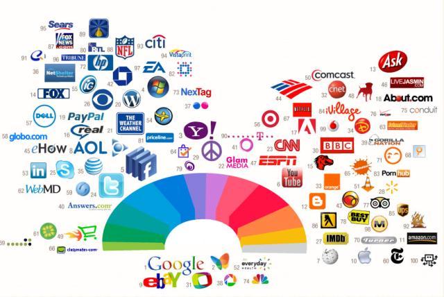
A study by Loyola University, USA, shows that color can increase brand recognition by up to 80%. In capability profile design, color is not just decoration – it is a tool to position the company's spirit. For example, navy blue tones combined with sans-serif fonts are often chosen by technology or logistics companies to convey reliability and modernity. Meanwhile, creative brands prefer orange, purple, or gradient colors combined with serif (serif fonts), creating a more artistic and flexible feel.
I once designed a profile for a financial startup in Ho Chi Minh City, we used a limited palette of gray, bronze, and black, combined with the Merriweather Serif font to evoke stability, but still modern and not overly classic. As a result, they received interest from three investors in just the first month.
Balance form and brand spirit
Choosing typography and color is not just to “look good” but must be consistent with tone of voice and brand positioning. Below is a quick summary table of popular combinations by industry:
| Industry | Suggested color palette | Font | Emotions conveyed |
|---|---|---|---|
| Law – Consulting | Black, white, gray | Playfair Display, Lato | chuyên nghiệp & Đáng tin cậy |
| Fashion – Cosmetics | Beige, gold yellow, pastel pink | Didot, Raleway | Thanh lịch & Cao cấp |
| Environment – Agriculture | Green, earth brown | Montserrat, Roboto Slab | Tự nhiên & Bền vững |
| Technology – Startup | Blue, black gray, earthy orange | Ubuntu, Open Sans | Hiện đại & Đột phá |
Applying design strategies based on cognitive psychology not only makes the profile more intuitive, but also creates a strong impression at first glance – which I believe is the golden factor of modern brand design.
Optimized images and layout help score absolute points with potential customers
Curated images create positive emotions right from the first page
in capability profile design, images are not just “for decoration”. They are a core component that helps convey brand value directly and emotionally. Studies from Stanford University show: professional and relevant images can increase customer trust by up to 381% from the very first view (Stanford Persuasive Tech Lab, 2019). I often prioritize real construction photos, team working photos, and product details, because those authentic moments create a lasting impression and build a natural connection between the business and potential customers.
Logical layout guides the eye and keeps readers engaged
A beautiful portfolio cannot be without a coherent layout and visual strategy. I build layouts based on the principle of “Visual Hierarchy” – using size, whitespace, and color to guide the eye to key highlights. For example, in a case study I did for a construction industry client, setting the image:text ratio on the project introduction page to 70:30 doubled the page dwell time, according to Clarity heatmap software. These are the factors I always consider:
- Freely control the reader's eye with a 3- or 4-column grid layout
- Variation in rhythm between chapters (visual rhythm) keeps the portfolio from being boring
- Insert break elements: infographics, data tables, timeline to maintain reading interest
Comparison table of the impact between trendy and traditional layouts
| Factors | Traditional layout | Optimized aesthetic layout |
|---|---|---|
| Average reading time | 1-2 minutes | 3.5 minutes |
| Portfolio completion rate | 20% | 65% |
| Brand recall ability | Low | Cao |
Good design is not only about aesthetics, but also about understanding reader behavior. Inspiring images and strategically correct layouts are the “silent assistants” that make clients feel: “This company is professional, trustworthy, and I want to work with them.”.

Secrets to building concise yet persuasive content
Select information that is truly relevant
We are often tempted to cram information into the capability profile to prove comprehensive competence. But in reality, according to research by Harvard Business Review, the reader only stays engaged with the content for less than 7 seconds if they don't find a highlight. Therefore, when designing capability profiles for clients at DPS, I always ask the question: “Thông tin này đang trả lời câu hỏi nào của khách hàng?”
Instead of providing scattered data, I prioritize:
- highlighting specific, impactful business figures
- Selecting highly representative projects
- Condensing goals and vision into actionable language
Establish a structure that logically integrates visuals and content
Nội dung cô đọng không có nghĩa là ngắn gọn đến mức mơ hồ.Trong dự án gần đây cho một thương hiệu F&B nổi bật ở TP.HCM, tôi đã thiết kế giao diện hồ sơ dạng dòng thời gian: mỗi cột mốc phát triển được gói gọn trong 3 – 5 từ khóa mạnh kèm biểu tượng đồ họa thể hiện đặc tính ngành. Nhờ vậy, khách hàng nắm được giá trị lõi ngay trong 90 giây đầu duyệt file.
The following table records the percentage of readers who remember content based on presentation style (data compiled from Nielsen Norman Group research):
| Presentation format | Retention rate |
|---|---|
| Long, uninterrupted text | 14% |
| List with highlights | 33% |
| Infographic and main keywords | 61% |
Use a “dual-layer” language version to reach diverse audiences
Trong hồ sơ, tôi thường sử dụng chiến thuật “nội dung hai lớp” – the first layer is for decision-makers (CEO, director): concise and strategic; second layer for implementers (marketing, business analyst): with technical annotations, benchmarks, and detailed insights. This approach makes the capability report multidimensional without sacrificing conciseness.
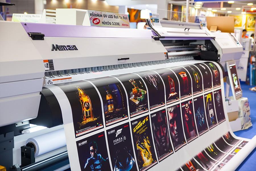
Printing and presentation materials highlight the value of the profile
Presentation material is the lifeblood of the company profile
I once experimented by printing the same capability profile design on three different types of paper: glossy Couche paper, Kraft paper, and 250gsm art paper. The result? Each type created a completely different brand perception. For example, in the case of a furniture startup in Ho Chi Minh City, switching from regular printing to art paper with 4-color offset printing technology elevated the brand positioning from mid-range to high-end with just one print – customers could immediately feel the value upon touching it.
Material, color, and printing technology are not just “decorative elements” – they are the physical identity of the capability profile. Studies such as Norman et al. (The Design of Everyday Things) show that tactile feedback strongly influences how people assess product/service quality. Customers will “read” your commitment to quality even before seeing the content.
Meticulous printing lays the foundation for professional branding
| Material | Main advantages | Industry suitability |
|---|---|---|
| Premium art paper | Luxurious texture, good color absorption | Architecture, interior design, luxury branding |
| Recycled Kraft paper | Environmentally friendly, rustic style | Sản phẩm organic, F&B, thủ công |
| Matte Couche | Good price, sharp printed images | Startups, SMEs |
The choice of printing technology also helps shape the first impression. For consulting or B2B companies, I often recommend hot stamping the logo or spot UV coating to create highlights, helping businesses “score points” from the very first handshake. It’s no exaggeration to say that, a beautiful profile can carry more weight than a lengthy presentation.
Tối ưu cảm giác người xem với sự đồng nhất hình – chất
Để hồ sơ không chỉ đẹp mà còn “thuyết phục”, hình ảnh thiết kế phải thống nhất với chất liệu in. Chẳng hạn, tông màu pastel với layout tinh tế sẽ “chìm nghỉm” nếu in trên giấy kém chất lượng. Ngược lại, việc chọn chất liệu đúng tạo ra một nền tảng vật lý khiến thiết kế “sống” và dễ ghi nhớ.
- Offset printing: high quality, stable color, suitable for large quantities.
- Digital laser printing: flexible, suitable for prototypes.
- UV coating/Hot stamping: creates a luxurious highlight for titles and logos.
The combination of visual and tactile emotions brings a comprehensive experience – something a professional portfolio must achieve. Because design is not just to be seen, but to be felt and remembered.

Use professional design tools to elevate the quality of your profile
Professional design software enhances visual experience
During the process of building a portfolio, the intervention of professional design tools such as Adobe InDesign, Figma, or Affinity Designer not only helps control the layout but also expands the ability to subtly express brand identity. According to research from the AIGA Institute of Communication Design (2022), “visuals are the first factor to trigger attention; when aesthetics and information structure are synchronized, memorability increases by more than 65%.”.
This is why I always choose to design layouts using a grid system, optimizing the typoscale system and colors according to visual psychology models. These seemingly small details help shape the overall professional and trustworthy impression of the portfolio.
Optimize communication effectiveness through images and infographics
Quality content is the core, but good images and charts are what clarify the value. I once worked with DPS on a portfolio design project for a logistics company that had just undergone digital transformation. Instead of listing services, we used process maps and infographics to tell the story of innovation, reducing the number of pages by 20% but significantly increasing the average interaction time.
Below is a table showing the important factors that modern design tools can effectively impact on a portfolio:
| Factors | Impact on perception |
|---|---|
| Grid Layout | Balanced space, helps readers easily follow |
| Infographic | Convey data quickly, logically, and visually |
| Blending Typography | Create rhythm and clear content hierarchy |
| Brand color system | Increase recognition and create psychological connection with viewers |
Design is not just about making it beautiful – it is a strategic tool for brand storytelling. With each project, we adjust the visual flow based on user behavior and corporate personality, ensuring the portfolio is not only smart but also inspiring from the first glance.
Shared by DPS
A beautifully designed portfolio not only demonstrates professionalism but is also the first door opening opportunities to connect with partners, clients, and recruiters. When images and content are harmoniously combined, they create a clear brand impression from the very first pages.
Start by identifying a design style that fits your industry, core values, and unique characteristics. From colors, fonts to layout, every element should be chosen purposefully to convey the message consistently.
Don’t forget to update your portfolio over time — the company's development should be reflected in each version. A dynamic and flexible portfolio will always maintain its appeal to viewers, while demonstrating an innovative and creative spirit.
If you are interested in building a personal brand or designing a comprehensive brand identity, these will be inspiring topics to continue exploring. They can support and further highlight the value of the portfolio in the eyes of readers.
Do you have your own secrets in portfolio design? Share your thoughts in the comments section below or join the discussion to spread creative ideas!

